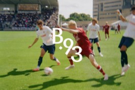
Visual identity for one of Denmark’s oldest clubs
B.93 (2023)
Visual identity for italian restaurant Graziano
Graziano (2024)
Visual identity for a danish design company making contemporary TV stands
Pedestal (2020)

Visual identity for Copenhagen based festival Syd For Solen
Syd For Solen (2024)
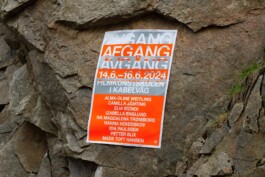
Identity for the BFA Degree Show at the Kabelvåg School of Moving Images
Avgang Afgang Avgång (2024)
Inboxed Identity (2021)
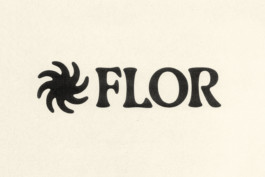
Visual identity for FLOR; a youth movement promoting biodiversity
FLOR (2023)
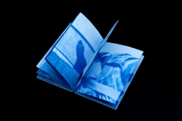
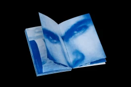
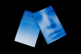
Book documenting innovation hub SPACE10 projects through the years
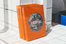
Home, SPACE10 (2023)
Identity for a film festival for talents at the National Film School of Denmark
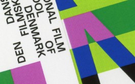
Generation Film Festival (2023)
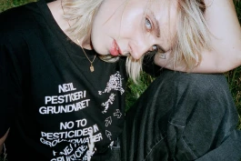
Apparel collection to promote the campaign 'No to pesticides in groundwater'
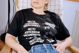
Postevand x MØ (2019)
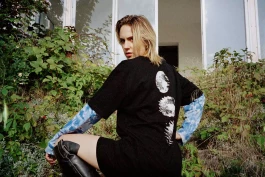
Identity and campaign for one of worlds biggest documentary film festivals
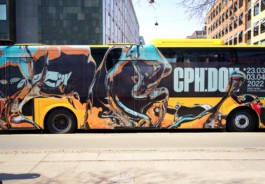
CPH:DOX (2022)
Frederik Plesner
I’m a designer based in Copenhagen working with visual identity, art direction and graphic design. I help clients express who they are by visualizing their beliefs through creative and conceptual design solutions based on an analytical and research-driven approach. Doing that I engage in a wide variety of task across multiple media – ranging from identity and digital applications to editorial and moving images. Currently I'm working as a senior designer at Barkas. Feel free to get in touch for more information, new projects, commissions or collaborations.
CONTACT
frederikplesner@gmail.com
(+45) 40719590
Instagram
EXPEIRENCE
2019 — now, senior designer, Barkas
2017 — 2019 designer, Lindhardt & Ringhoff Publishing
EDUCATION
2020 — 2022 MA, GCD, The Royal Danish Academy
2016 — 2019 BA, GD, Danish School of Media and Journalism
Projects
Year
2023
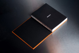
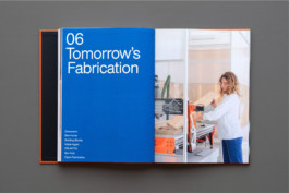
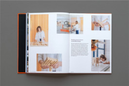
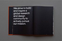
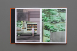
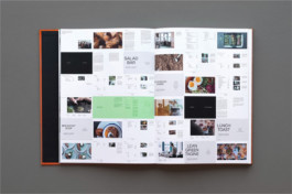
Archival book incapsulating everything that the, now closed, innovation hub SPACE10 was about. Typeface, Helvetica Now. Size, 22x30cm. Printing, Heenemann-Druck. Paper, Metapaper Extrasmooth 120 g/m². Done at Barkas.
Archival book incapsulating everything that the, now closed, innovation hub SPACE10 was about. Typeface, Helvetica Now. Size, 22x30cm. Printing, Heenemann-Druck. Paper, Metapaper Extrasmooth 120 g/m². Done at Barkas.
Archival book incapsulating everything that the, now closed, innovation hub SPACE10 was about. Typeface, Helvetica Now. Size, 22x30cm. Printing, Heenemann-Druck. Paper, Metapaper Extrasmooth 120 g/m². Done at Barkas.
Archival book incapsulating everything that the, now closed, innovation hub SPACE10 was about. Typeface, Helvetica Now. Size, 22x30cm. Printing, Heenemann-Druck. Paper, Metapaper Extrasmooth 120 g/m². Done at Barkas.
Archival book incapsulating everything that the, now closed, innovation hub SPACE10 was about. Typeface, Helvetica Now. Size, 22x30cm. Printing, Heenemann-Druck. Paper, Metapaper Extrasmooth 120 g/m². Done at Barkas.
Archival book incapsulating everything that the, now closed, innovation hub SPACE10 was about. Typeface, Helvetica Now. Size, 22x30cm. Printing, Heenemann-Druck. Paper, Metapaper Extrasmooth 120 g/m². Done at Barkas.
Archival book incapsulating everything that the, now closed, innovation hub SPACE10 was about. Typeface, Helvetica Now. Size, 22x30cm. Printing, Heenemann-Druck. Paper, Metapaper Extrasmooth 120 g/m². Done at Barkas.
Archival book incapsulating everything that the, now closed, innovation hub SPACE10 was about. Typeface, Helvetica Now. Size, 22x30cm. Printing, Heenemann-Druck. Paper, Metapaper Extrasmooth 120 g/m². Done at Barkas.
2023
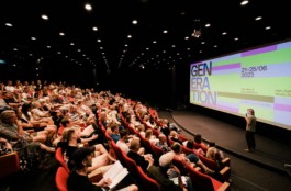
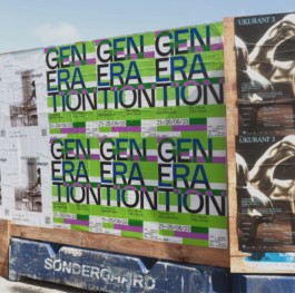
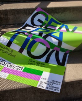
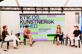
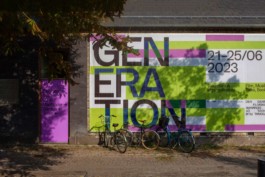
Visual identity for Generation, a graduation film festival for talents at the National Film School of Denmark. The Identity is based on the idea of disrupting and transforming the base identity of the school into a bolder visual expression that reflects the young and emerging talent of the class of 2023. Done at Barkas.
Visual identity for Generation, a graduation film festival for talents at the National Film School of Denmark. The Identity is based on the idea of disrupting and transforming the base identity of the school into a bolder visual expression that reflects the young and emerging talent of the class of 2023. Done at Barkas.
Visual identity for Generation, a graduation film festival for talents at the National Film School of Denmark. The Identity is based on the idea of disrupting and transforming the base identity of the school into a bolder visual expression that reflects the young and emerging talent of the class of 2023. Done at Barkas.
Visual identity for Generation, a graduation film festival for talents at the National Film School of Denmark. The Identity is based on the idea of disrupting and transforming the base identity of the school into a bolder visual expression that reflects the young and emerging talent of the class of 2023. Done at Barkas.
Visual identity for Generation, a graduation film festival for talents at the National Film School of Denmark. The Identity is based on the idea of disrupting and transforming the base identity of the school into a bolder visual expression that reflects the young and emerging talent of the class of 2023. Done at Barkas.
Visual identity for Generation, a graduation film festival for talents at the National Film School of Denmark. The Identity is based on the idea of disrupting and transforming the base identity of the school into a bolder visual expression that reflects the young and emerging talent of the class of 2023. Done at Barkas.
Visual identity for Generation, a graduation film festival for talents at the National Film School of Denmark. The Identity is based on the idea of disrupting and transforming the base identity of the school into a bolder visual expression that reflects the young and emerging talent of the class of 2023. Done at Barkas.
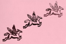
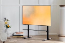
2021
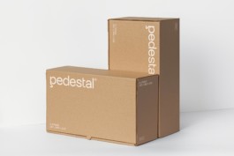
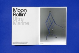
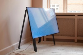
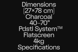
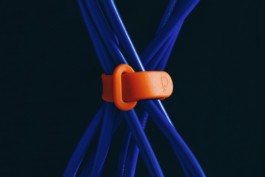
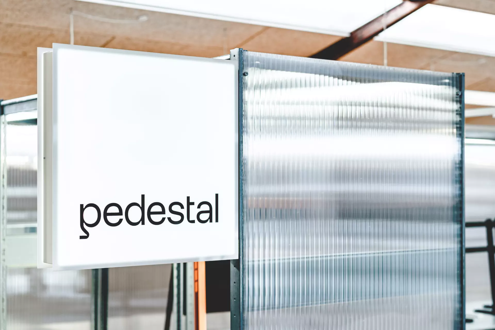
Visual identity for Pedestal, a danish design company producing contemporary, universal TV stands and screen accessories. The logo was designed to celebrate the bended shapes of the products and making it useful as a lettermark as well was important to have brand recognition on small products like cables and other accessories. The colourful noise is a digital translation of an analogue reference inspired by an era when TV’s looked their best. Typeface, FK Display & Suisse Int'l. Done at Barkas.
Visual identity for Pedestal, a danish design company producing contemporary, universal TV stands and screen accessories. The logo was designed to celebrate the bended shapes of the products and making it useful as a lettermark as well was important to have brand recognition on small products like cables and other accessories. The colourful noise is a digital translation of an analogue reference inspired by an era when TV’s looked their best. Typeface, FK Display & Suisse Int'l. Done at Barkas.
Visual identity for Pedestal, a danish design company producing contemporary, universal TV stands and screen accessories. The logo was designed to celebrate the bended shapes of the products and making it useful as a lettermark as well was important to have brand recognition on small products like cables and other accessories. The colourful noise is a digital translation of an analogue reference inspired by an era when TV’s looked their best. Typeface, FK Display & Suisse Int'l. Done at Barkas.
Visual identity for Pedestal, a danish design company producing contemporary, universal TV stands and screen accessories. The logo was designed to celebrate the bended shapes of the products and making it useful as a lettermark as well was important to have brand recognition on small products like cables and other accessories. The colourful noise is a digital translation of an analogue reference inspired by an era when TV’s looked their best. Typeface, FK Display & Suisse Int'l. Done at Barkas.
Visual identity for Pedestal, a danish design company producing contemporary, universal TV stands and screen accessories. The logo was designed to celebrate the bended shapes of the products and making it useful as a lettermark as well was important to have brand recognition on small products like cables and other accessories. The colourful noise is a digital translation of an analogue reference inspired by an era when TV’s looked their best. Typeface, FK Display & Suisse Int'l. Done at Barkas.
Visual identity for Pedestal, a danish design company producing contemporary, universal TV stands and screen accessories. The logo was designed to celebrate the bended shapes of the products and making it useful as a lettermark as well was important to have brand recognition on small products like cables and other accessories. The colourful noise is a digital translation of an analogue reference inspired by an era when TV’s looked their best. Typeface, FK Display & Suisse Int'l. Done at Barkas.
Visual identity for Pedestal, a danish design company producing contemporary, universal TV stands and screen accessories. The logo was designed to celebrate the bended shapes of the products and making it useful as a lettermark as well was important to have brand recognition on small products like cables and other accessories. The colourful noise is a digital translation of an analogue reference inspired by an era when TV’s looked their best. Typeface, FK Display & Suisse Int'l. Done at Barkas.
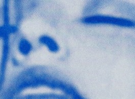
2021
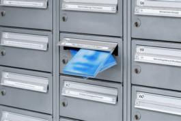
152 pages of images collected from spam mails received over the last 10 years turned into a book that looks at how humanity is represented in the invading world of image spam. Printing, Obra Press. Binding, Handbound. Typeface, Arial Narrow. Paper, 120G/m² Metapaper. Size, 17x25cm.
152 pages of images collected from spam mails received over the last 10 years turned into a book that looks at how humanity is represented in the invading world of image spam. Printing, Obra Press. Binding, Handbound. Typeface, Arial Narrow. Paper, 120G/m² Metapaper. Size, 17x25cm.
152 pages of images collected from spam mails received over the last 10 years turned into a book that looks at how humanity is represented in the invading world of image spam. Printing, Obra Press. Binding, Handbound. Typeface, Arial Narrow. Paper, 120G/m² Metapaper. Size, 17x25cm.
152 pages of images collected from spam mails received over the last 10 years turned into a book that looks at how humanity is represented in the invading world of image spam. Printing, Obra Press. Binding, Handbound. Typeface, Arial Narrow. Paper, 120G/m² Metapaper. Size, 17x25cm.
152 pages of images collected from spam mails received over the last 10 years turned into a book that looks at how humanity is represented in the invading world of image spam. Printing, Obra Press. Binding, Handbound. Typeface, Arial Narrow. Paper, 120G/m² Metapaper. Size, 17x25cm.
152 pages of images collected from spam mails received over the last 10 years turned into a book that looks at how humanity is represented in the invading world of image spam. Printing, Obra Press. Binding, Handbound. Typeface, Arial Narrow. Paper, 120G/m² Metapaper. Size, 17x25cm.
2019
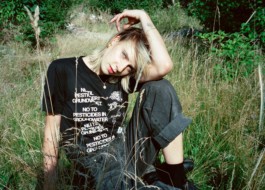
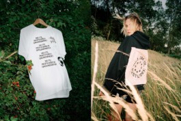
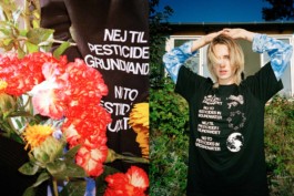
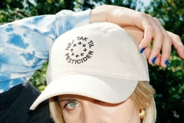
Campaign and capsule collection 'No to pesticides in groundwater' for Postevand, a Danish tap water brand that sells tap water in eco friendly cartons, to save nature and the groundwater. All products are deadstock fabric or second hand, profits go directly to planting trees. Typeface, Nimbus Sans. Print, screenprint and embroidery. Photos by Fryd Frydendal. Done at Barkas.
Campaign and capsule collection 'No to pesticides in groundwater' for Postevand, a Danish tap water brand that sells tap water in eco friendly cartons, to save nature and the groundwater. All products are deadstock fabric or second hand, profits go directly to planting trees. Typeface, Nimbus Sans. Print, screenprint and embroidery. Photos by Fryd Frydendal. Done at Barkas.
Campaign and capsule collection 'No to pesticides in groundwater' for Postevand, a Danish tap water brand that sells tap water in eco friendly cartons, to save nature and the groundwater. All products are deadstock fabric or second hand, profits go directly to planting trees. Typeface, Nimbus Sans. Print, screenprint and embroidery. Photos by Fryd Frydendal. Done at Barkas.
Campaign and capsule collection 'No to pesticides in groundwater' for Postevand, a Danish tap water brand that sells tap water in eco friendly cartons, to save nature and the groundwater. All products are deadstock fabric or second hand, profits go directly to planting trees. Typeface, Nimbus Sans. Print, screenprint and embroidery. Photos by Fryd Frydendal. Done at Barkas.
Campaign and capsule collection 'No to pesticides in groundwater' for Postevand, a Danish tap water brand that sells tap water in eco friendly cartons, to save nature and the groundwater. All products are deadstock fabric or second hand, profits go directly to planting trees. Typeface, Nimbus Sans. Print, screenprint and embroidery. Photos by Fryd Frydendal. Done at Barkas.
Campaign and capsule collection 'No to pesticides in groundwater' for Postevand, a Danish tap water brand that sells tap water in eco friendly cartons, to save nature and the groundwater. All products are deadstock fabric or second hand, profits go directly to planting trees. Typeface, Nimbus Sans. Print, screenprint and embroidery. Photos by Fryd Frydendal. Done at Barkas.
2022
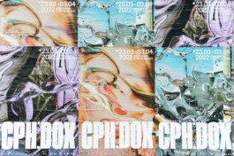
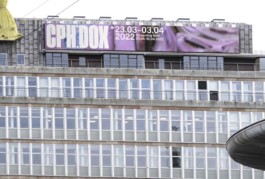
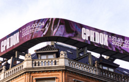
Identity and campaign for CPH:DOX, one of the biggest documentary film festivals in the world. The task was to create an identity that could embrace collaborations with young artists, who interpret the theme of the festival into a new visual universe every year. Together with artist Caroline Vang, we interpreted their theme of 2022: perception. Typeface, Baikal Variable. Done at Barkas.
Identity and campaign for CPH:DOX, one of the biggest documentary film festivals in the world. The task was to create an identity that could embrace collaborations with young artists, who interpret the theme of the festival into a new visual universe every year. Together with artist Caroline Vang, we interpreted their theme of 2022: perception. Typeface, Baikal Variable. Done at Barkas.
Identity and campaign for CPH:DOX, one of the biggest documentary film festivals in the world. The task was to create an identity that could embrace collaborations with young artists, who interpret the theme of the festival into a new visual universe every year. Together with artist Caroline Vang, we interpreted their theme of 2022: perception. Typeface, Baikal Variable. Done at Barkas.
Identity and campaign for CPH:DOX, one of the biggest documentary film festivals in the world. The task was to create an identity that could embrace collaborations with young artists, who interpret the theme of the festival into a new visual universe every year. Together with artist Caroline Vang, we interpreted their theme of 2022: perception. Typeface, Baikal Variable. Done at Barkas.
Identity and campaign for CPH:DOX, one of the biggest documentary film festivals in the world. The task was to create an identity that could embrace collaborations with young artists, who interpret the theme of the festival into a new visual universe every year. Together with artist Caroline Vang, we interpreted their theme of 2022: perception. Typeface, Baikal Variable. Done at Barkas.
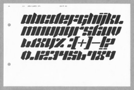
2020
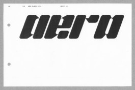
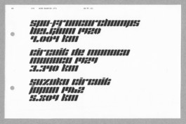
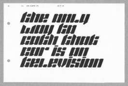
Experimental display font inspired by aerodynamics. It’s a slanted, rectangular and geometric typeface in 1 weight.
Experimental display font inspired by aerodynamics. It’s a slanted, rectangular and geometric typeface in 1 weight.
Experimental display font inspired by aerodynamics. It’s a slanted, rectangular and geometric typeface in 1 weight.
Experimental display font inspired by aerodynamics. It’s a slanted, rectangular and geometric typeface in 1 weight.
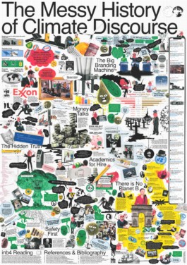
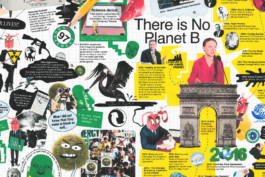
A0 poster explaining the messy history of climate discourse through a complex storyline told by three humanised energy sources based on historical references and data visualisations. Team: Osvald Landmark & Frederik Wendt. Typeface: Helvetica. Print: Digital Inkjet. Size 841x1189mm.
2021
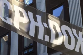
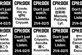
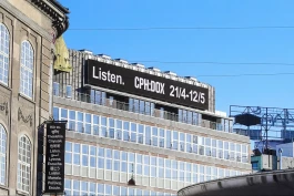
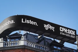
Visual identity for danish documentary film festival CPH:DOX. With activism being the theme of 2021, the identity takes use of multiple translations of the tagline 'Don't Just Watch. Listen.' as well as having an open and democratic approach to the design using a monochrome palette combined with the open source and multilingual typeface Arial Unicode. Done at Barkas.
Visual identity for danish documentary film festival CPH:DOX. With activism being the theme of 2021, the identity takes use of multiple translations of the tagline 'Don't Just Watch. Listen.' as well as having an open and democratic approach to the design using a monochrome palette combined with the open source and multilingual typeface Arial Unicode. Done at Barkas.
Visual identity for danish documentary film festival CPH:DOX. With activism being the theme of 2021, the identity takes use of multiple translations of the tagline 'Don't Just Watch. Listen.' as well as having an open and democratic approach to the design using a monochrome palette combined with the open source and multilingual typeface Arial Unicode. Done at Barkas.
Visual identity for danish documentary film festival CPH:DOX. With activism being the theme of 2021, the identity takes use of multiple translations of the tagline 'Don't Just Watch. Listen.' as well as having an open and democratic approach to the design using a monochrome palette combined with the open source and multilingual typeface Arial Unicode. Done at Barkas.
2021
Animations promoting the launch of Acne Studios new website in 2021. Done at Barkas.
2019

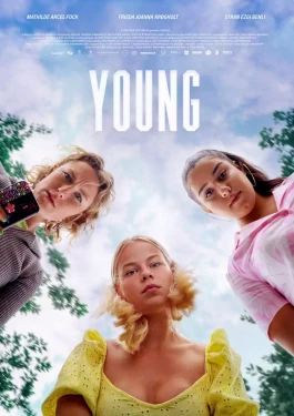
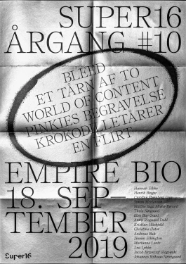
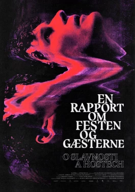
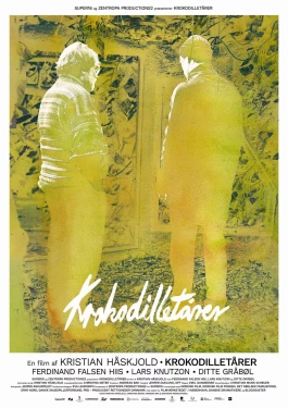
Various filmposters done for the National Film School of Denmark and film collective SUPER16.
Various filmposters done for the National Film School of Denmark and film collective SUPER16.
Various filmposters done for the National Film School of Denmark and film collective SUPER16.
Various filmposters done for the National Film School of Denmark and film collective SUPER16.
Various filmposters done for the National Film School of Denmark and film collective SUPER16.
Various filmposters done for the National Film School of Denmark and film collective SUPER16.
Frederik Plesner Graphic design
Copenhagen, DK
Creative Director and Co-Founder of OFF.group. Previously a Senior Designer at Barkas in Copenhagen. My work focuses on building visual identity systems that balance clarity with character. Bridging strategic thinking and hands-on design, I develop concept-driven design solutions informed by analysis and research—always starting from how brands lives and act in the real world. Feel free to get in touch regarding new projects, commissions, or collaborations.
Contact
frederikplesner@gmail.com
(+45) 40719590
Instagram
Experience
2026–Now, Founder & Design Director, OFF.group
2018–2025, Senior Designer, Barkas
2017–2018, Designer, Lindhardt & Ringhoff Publishing
Education
2020 — 2022 MA, GCD, The Royal Danish Academy
2016 — 2019 BA, GD, Danish School of Media and Journalism

© 2026